The hunt for great LEGO colors
Looking to add unique color combinations to your LEGO creations? Keep your eyes open and your camera ready to find all the inspiration you need!
When Tom’s article “How to include Architecture in your next trip” came out, I happened to be on vacation with my family in the Bahamas. Just being on the Brick Architect writing team must have been rubbing off on me, because I had been snapping a ton of photos throughout the trip. But it wasn’t just architecture I was hunting for.
My family and I were staying at the Atlantis resort, so we were surrounding by a lot of interesting, faux-ancient styles of architecture. There were several times I saw a unique piece of architectural detail, and I immediately began thinking about how I could recreate it in LEGO.

Decorative tiles at the Lynden Pindling International Airport in Nassau use some interesting color combinations.
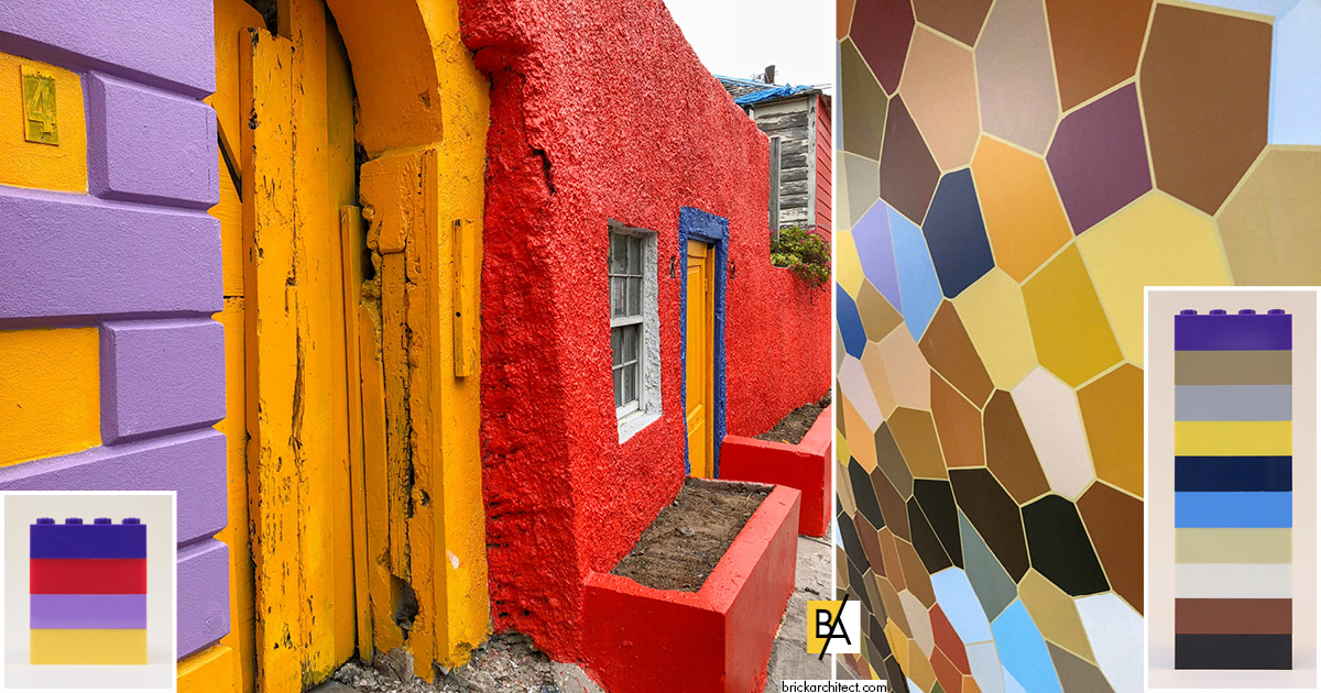
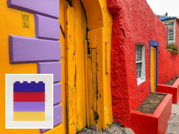
Color is all around us! In addition to taking photos of buildings and ornamentation, I was constantly capturing colors combinations that caught my eye: the floor of the lobby, the vibrantly-painted buildings in downtown Nassau, and decorative tiles at the airport. By capturing interesting color combinations you encounter with your camera, you will develop a library of color palettes to refer to while building.
From photo to LEGO
Sometimes the photos live on my phone for a while, or they get copied into a folder that lives on my desktop. But I had only been home a few days before I pulled out my bin of 2×4 bricks to start creating my color swatches. Of course, it’s not necessary to create physical swatches with LEGO pieces, but isn’t building with LEGO something we all love to do anyway? Creating the palettes in the real world also allows you to manipulate the order of the colors, trying different hues next to each other.
Unless you’ve got an extensive collection of LEGO pieces in a wide range of colors, you’ll probably run into problems when trying to match your brick-built palettes to your photos. And with only 40 colors currently in production by LEGO, you will always encounter colors that just don’t match anything made by LEGO. But don’t worry; it’s not about matching the perfect hues, it’s about translating those colors into LEGO’s palette.

A wall-sized mural at Boston’s Logan International Airport includes many disparate colors that shouldn’t look good together, but somehow do.
If I think there might be a better color to use (that I just don’t have) I consult The Unofficial LEGO Color Guide by Christoph Bartneck. The book was published in New Zealand, and I ordered my copy from bookdepository.com, an international book site that ships free around the world. The book is a great resource, but like all four-color printed material, it’s impossible for it to perfectly match the pigments LEGO uses to color their elements. That being said, it is close enough to give you a sense of whether there’s a better color available out there.
Fellow BA writer Christine alerted me to Coolors, which is a great site/app to randomly generate color palettes. You can also upload a photo and it will identify the color palette for you, which you can export and save. Because the color swatches are so large (on a computer screen, at least), you can hold up LEGO pieces to find the closest match. The only limitation I’ve found is that it seems that each palette must be five colors, no more, no less.
Continuing the hunt
Obviously, this kind of color hunting should not be confined to vacation. As I mentioned earlier, color is all around us, and that’s true in your home area as well. Unusual house paint colors. Book jackets. Art in galleries or museums. Clothes, and home furnishings. Paint company brochures that show their wares on houses and in rooms. I often find colors I love when I’m browsing apps or sites on my phone, so I snap a screen shot.

The colors in a student-designed dress, on display in a building at the Rhode Island School of Design immediately caught my eye.
Bold colors will likely be what catches your eye most readily, but don’t overlook muted colors that will make for more realistic buildings. Once you’ve built up a stockpile of images and swatches, you’ll never be at a loss for a color palette again!
Unless otherwise noted, photos in this article by Michael Kindness.


