Understanding Color, Bricks Magazine #14
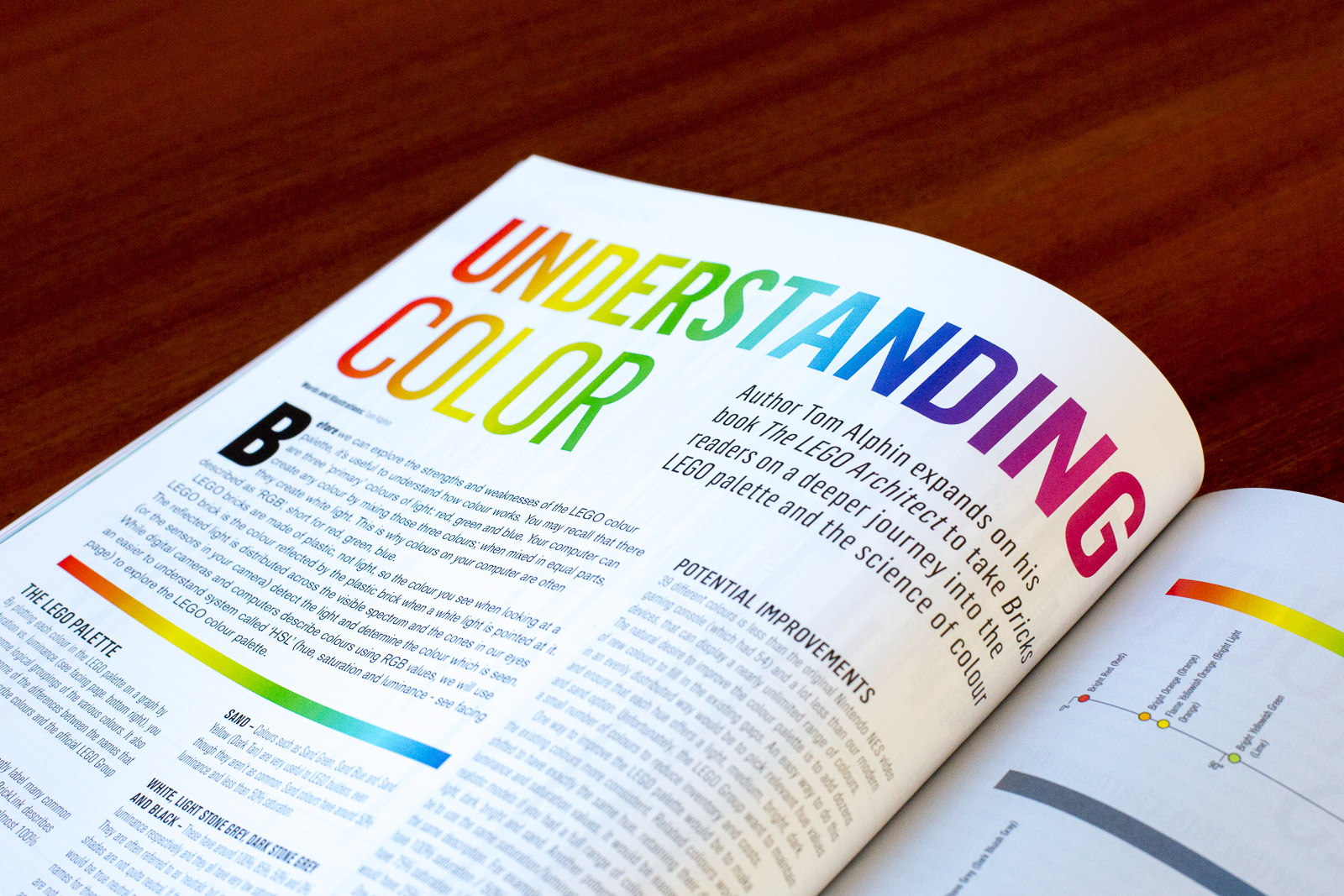
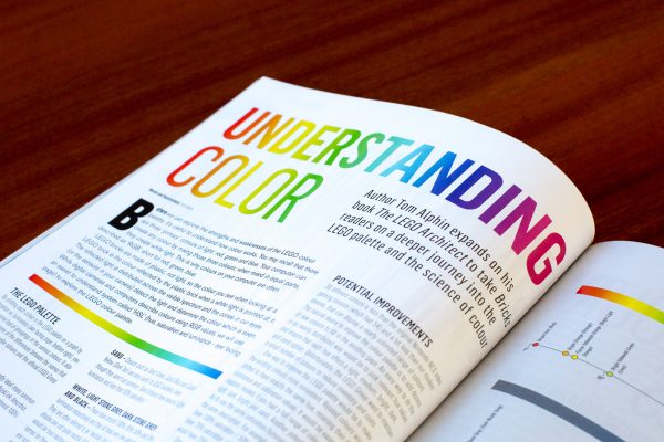
Learn more about the 39 colors in the LEGO Color Palette. I explain how color works, gaps in the colors available to LEGO builders, and changes to the color palette over time.
For the second month in a row, I’ve had an opportunity to write an in-depth article about challenging topics for LEGO builders. Let’s take a look at Issue #14 of Bricks magazine.
The latest issue of Bricks Magazine covers a range of topics related to the LEGO color palette including the history of the LEGO color palette and techniques for creating harmonious color schemes. It also includes my article which takes a hard look at the current LEGO Color palette and shared some insights into the choices that the LEGO Group has made.
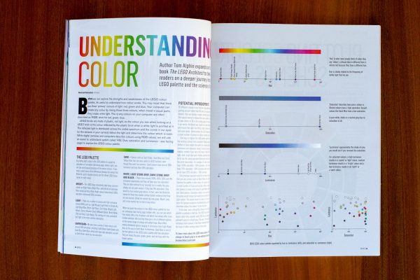
The article text starts with a very brief explanation of how color works, reminding readers that the color we see is determined by the wavelengths of light which are absorbed and reflected off the LEGO brick. I go on to explain that there are several ways to describe colors including RGB and HSL, and I use HSL method to organize the LEGO color palette because it helps us see patterns and gaps in the LEGO color palette.
The main discovery in this analysis was the reason behind the discrepancy between the common names for each color that LEGO builders frequently use (ex: on BrickLink), and the official names for each color that The LEGO Group uses internally. It turns out that the official names almost always use descriptors such as “bright”, “light”, “earth”, and “sand”. Each of these corresponds to patterns in saturation and luminance which I described in the article.
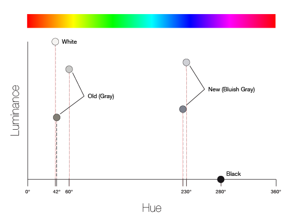
The article closes with some suggestions on how the LEGO Group could have improved the LEGO color palette, although I am quick to note that making changes to existing color would be met with frustration by the LEGO community, as it was when they changed from the old reddish “gray” to the new “bluish gray” color back in 2005.
You can buy the print or digital edition of Bricks magazine at http://store.republic66media.com/.
The one challenge with print is that there is limited space, so I have prepared a longer version of the article with some additional details on my website. This includes additional illustrations looking at the orange and blue hues in depth, as well as this illustration explaining the old reddish “gray” vs. new “bluish gray” changes on a chart of Hue and Luminance.

