
Brick Architect Style Guide
Design Grid
The layout is based on a grid, with columns of 140px wide, and padding of 20px between each column. That’s why the three smallest image sizes are 140px (one column), 300px (two columns), and 620px (4 columns).
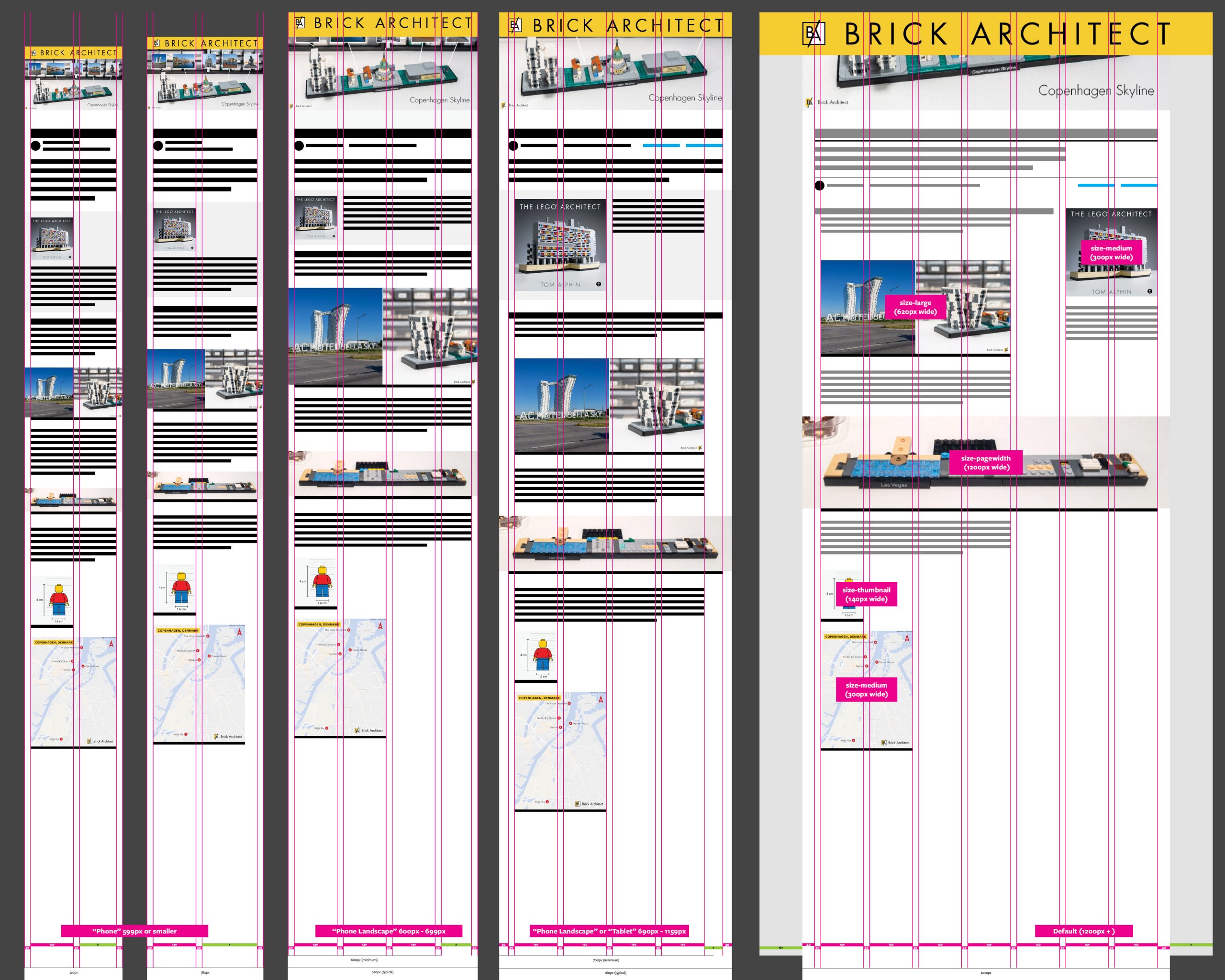
Brick Architect website uses a fairly rigid design grid, with break points based on display width which result in a simpler page layout.
On large screens, there are a total of 7 columns: 4-columns for body text, one column of empty space (140px + 2×20px padding), and a two-column sidebar on the right hand side of the display (300px wide).
Basic text
Basic text will appear in one of three sizes, depending on the width of your display. Text size doesn’t change very much; text needs to remain readable on small screens, but not too big even on very large screens. 140% line spacing is generous for easy reading of longer lines.
- 1200px or wider – 24px / 20px / 18px
- 690px to 1159px – 22px / 19px / 17px
- 689px or narrower – 21px / 18px / 16px
Examples:
“larger” text – 140% line height. 24/22/21px.
Regular, Link (a), Bold (strong), Link (strong a), Italic (em), Link (em a), Bold+Italic (strong em), Link (strong em a).
Normal text – 140% line height. 20/19/18px.
Regular, Link (a), Bold (strong), Link (strong a), Italic (em), Link (em a), Bold+Italic (strong em), Link (strong em a).
“smaller” text – 125% line height. 18/17/16px.
Regular, Link (a), Bold (strong), Link (strong a), Italic (em), Link (em a), Bold+Italic (strong em), Link (strong em a).
Additional Test Cases:
- Regular ≈ Link (a)
- Bold (strong) ≈ Link (strong a) = Link (a strong)
- Italic (em) ≈ Link (em a) = Link (a em)
- Bold+Italic (strong em) = Italic+Bold (em strong) ≈ Link (strong em a) = Link (em strong a) = Link (a strong em) = Link (strong a em) = Link (em a strong)
HTML Code
<p>text</p>
<p class="smaller">text</p>
<p class="larger">text</p>
LEGO Colors
LEGO Colors can be inserted within text using the Official LEGO Group names, with the spaces removed.
Example
Tongue picanha 135Sand Blue pork belly doner, boudin 353Vibrant CoralCoral pork chop, 42Transparent Light BlueTrans-Light Blue ham hock ribeye sausage 154Dark Red beef ribs meatball chicken. Cupim bacon pork loin, meatball short 1White loin filet mignon doner.
HTML Code
[xyz-ihs snippet="[ColorName]"]
| 1White | [xyz-ihs snippet="White"] |
| 194Medium Stone GreyLight Bluish Gray | [xyz-ihs snippet="MediumStoneGrey"] |
| 199Dark Stone GreyDark Bluish Gray | [xyz-ihs snippet="DarkStoneGrey"] |
| 26Black | [xyz-ihs snippet="Black"] |
| 5Brick YellowTan | [xyz-ihs snippet="BrickYellow"] |
| 1089Warm TanMedium Tan | [xyz-ihs snippet="WarmTan"] |
| 138Sand YellowDark Tan | [xyz-ihs snippet="SandYellow"] |
| 370Medium Brown | [xyz-ihs snippet="MediumBrown"] |
| 308Dark Brown | [xyz-ihs snippet="DarkBrown"] |
| 283Light NougatLight Flesh | [xyz-ihs snippet="LightNougat"] |
| 18NougatFlesh | [xyz-ihs snippet="Nougat"] |
| 312Medium NougatMedium Dark Flesh | [xyz-ihs snippet="MediumNougat"] |
| 192Reddish Brown | [xyz-ihs snippet="ReddishBrown"] |
| 151Sand Green | [xyz-ihs snippet="SandGreen"] |
| 330Olive Green | [xyz-ihs snippet="OliveGreen"] |
| 135Sand Blue | [xyz-ihs snippet="SandBlue"] |
| 21Bright RedRed | [xyz-ihs snippet="BrightRed"] |
| 154Dark Red | [xyz-ihs snippet="DarkRed"] |
| 402Reddish Orange | [xyz-ihs snippet="ReddishOrange"] |
| 106Bright OrangeOrange | [xyz-ihs snippet="BrightOrange"] |
| 38Dark Orange | [xyz-ihs snippet="DarkOrange"] |
| 191Flame Yellowish OrangeBright Light Orange | [xyz-ihs snippet="FlameYellowishOrange"] |
| 226Cool YellowBright Light Yellow | [xyz-ihs snippet="CoolYellow"] |
| 24Bright YellowYellow | [xyz-ihs snippet="BrightYellow"] |
| 368Vibrant YellowNeon Yellow | [xyz-ihs snippet="VibrantYellow"] |
| 326Spring Yellowish GreenYellowish Green | [xyz-ihs snippet="SpringYellowishGreen"] |
| 119Bright Yellowish GreenLime | [xyz-ihs snippet="BrightYellowishGreen"] |
| 37Bright Green | [xyz-ihs snippet="BrightGreen"] |
| 28Dark GreenGreen | [xyz-ihs snippet="DarkGreen"] |
| 141Earth GreenDark Green | [xyz-ihs snippet="EarthGreen"] |
| 107Bright Bluish GreenDark Turquoise / Teal | [xyz-ihs snippet="BrightBluishGreen"] |
| 323AquaLight Aqua | [xyz-ihs snippet="Aqua"] |
| 322Medium AzurMedium Azure | [xyz-ihs snippet="MediumAzur"] |
| 321Dark AzurDark Azure | [xyz-ihs snippet="DarkAzur"] |
| 212Light Royal BlueBright Light Blue | [xyz-ihs snippet="LightRoyalBlue"] |
| 102Medium Blue | [xyz-ihs snippet="MediumBlue"] |
| 23Bright BlueBlue | [xyz-ihs snippet="BrightBlue"] |
| 140Earth BlueDark Blue | [xyz-ihs snippet="EarthBlue"] |
| 222Light PurpleBright Pink | [xyz-ihs snippet="LightPurple"] |
| 322Bright PurpleDark Pink | [xyz-ihs snippet="BrightPurple"] |
| 42Bright Reddish VioletMagenta | [xyz-ihs snippet="BrightReddishViolet"] |
| 353Vibrant CoralCoral | [xyz-ihs snippet="VibrantCoral"] |
| 325Lavender | [xyz-ihs snippet="Lavender"] |
| 324Medium Lavender | [xyz-ihs snippet="MediumLavender"] |
| 268Medium LilacDark Purple | [xyz-ihs snippet="MediumLilac"] |
Transparent Colors:
| 40Transparent Trans-Clear | [xyz-ihs snippet="Transparent"] |
| 111Transparent BrownTrans-Black | [xyz-ihs snippet="TransparentBrown"] |
| 41Transparent RedTrans-Red | [xyz-ihs snippet="TransparentRed"] |
| 47Transparent Fluorescent Reddish OrangeTrans-Neon Orange | [xyz-ihs snippet="TransparentFlouorescentReddishOrange"] |
| 182Transparent Bright OrangeTrans-Orange | [xyz-ihs snippet="TransparentBrightOrange"] |
| 44Transparent YellowTrans-Yellow | [xyz-ihs snippet="TransparentYellow"] |
| 49Transparent Fluorescent GreenTrans-Neon Green | [xyz-ihs snippet="TransparentFluorescentGreen"] |
| 311Transparent Bright GreenTrans-Bright Green | [xyz-ihs snippet="TransparentBrightGreen"] |
| 48Transparent GreenTrans-Green | [xyz-ihs snippet="TransparentGreen"] |
| 42Transparent Light BlueTrans-Light Blue | [xyz-ihs snippet="TransparentLightBlue"] |
| 43Transparent BlueTrans-Dark Blue | [xyz-ihs snippet="TransparentBlue"] |
| 143Transparent Fluorescent BlueTrans-Medium Blue | [xyz-ihs snippet="TransparentFluorescentBlue"] |
| 126Transparent Bright Bluish VioletTrans-Purple | [xyz-ihs snippet="TransparentTransparentBrightBluishVioletBrightViolet"] |
| 113Transparent Medium Reddish VioletTrans-Dark Pink | [xyz-ihs snippet="TransparentMediumReddishViolet"] |
Pearl/Chrome/Metallic Colors:
| 315 Silver MetallicFlat Silver | [xyz-ihs snippet="SilverMetallic"] |
| 316Titanium MetallicPearl Dark Gray | [xyz-ihs snippet="TitaniumMetallic"] |
| 297Warm GoldPearl Gold | [xyz-ihs snippet="WarmGold"] |
| 309Metalized SilverSilver | [xyz-ihs snippet="MetalizedSilver"] |
| 310Metalized GoldGold | [xyz-ihs snippet="MetalizedGold"] |
| 298Cool Silver, Drum LacqueredMetallic Silver | [xyz-ihs snippet="CoolSilverDrumLacquered"] |
| 299Warm Gold Drum LacqueredMetallic Gold | [xyz-ihs snippet="WarmGoldDrumLacquered"] |
Other Colors:
| 129Transparent Bluish Violet (Glitter)Glitter Trans-Purple | [xyz-ihs snippet="GlitterTransPurple"] |
| 329White GlowGlow In The Dark White | [xyz-ihs snippet="GlowInDarkWhite"] |
Retired Colors:
| 2GreyLight Gray | [xyz-ihs snippet="LightGrey"] |
| 27Dark GreyDark Gray | [xyz-ihs snippet="DarkGrey"] |
| 217BrownMedium Brown | [xyz-ihs snippet="Brown"] |
| 11Pastel BlueMaersk Blue | [xyz-ihs snippet="MaerskBlue"] |
| 4Brick RedFabuland Brown | [xyz-ihs snippet="FabulandBrown"] |
| 12Light Orange BrownEarth Orange | [xyz-ihs snippet="EarthOrange"] |
| 20NatureMilky White | [xyz-ihs snippet="MilkyWhite"] |
Images
Images are central to our editorial style. Large, high-impact images are great for telling a story, creating energy, and used as a segue or conclusion. Smaller images are used to illustrate concepts.
Main types of images used on the site:
- Width of Page (1200px or wider) "size-pagewidth"
Image displayed without a left and right border on all screen sizes. Fills the width of content area. - Large (620px wide) "size-large"
Most images will be large, appearing inline with text. (Older articles have a “Large’ size of 600px wide. It was updated to 620 to fit the design grid.) - Medium (300px wide) "size-medium"
Medium images provide supporting details. - Thumbnail (140px wide) "size-thumbnail"
Thumbnail images are rarely used. (Only use case so far is to show a single LEGO Part Label.) – Older articles have a “thumbnail” size of 150px wide. This was updated to 140px to better fit the grid.
Special Image Sizes:
- Featured Image (1200x630px)
Every longform article includes a Featured Image. It is used on the homepage, at the top of the article, and is displayed when a link to the article is shared on social media. (1200×630 is the optimal resolution for the OpenGraph standard used by Facebook.)
Deprecated sizes (do not use).
- Full (1200px or wider) "size-full"
(DEPRECATED) – Legacy way to specify image should match width of page. Should use “size-pagewidth” instead; it sends down a more reasonably sized file download. - Small (???) "size-small"
(NOT SUPPORTED) – Earlier documentation mentioned this size, but I don’t think it was ever used and is not offered as an option in the WordPress UX.
Example: Width of Page
Full Bleed Images have the largest impact, especially on larger displays. If the image is larger than 1200px wide, it is scaled to that size. Because they are full width, it is important to not use portrait images in this format. I recommend very wide images—no taller than about a 2×1 ratio. (ex: 1200x600px)
(A “size-pagewidth” image can be a single very wide image, or a single image file that is a composite of several images.)

The sanctuary features beautiful geometric detailing.
Example: Large
Most of the images in an article should be “large”, which appear inline with the main column of text. It is narrow enough to allow sidebar content on large displays. They can be landscape or square images, but portrait is not recommended.
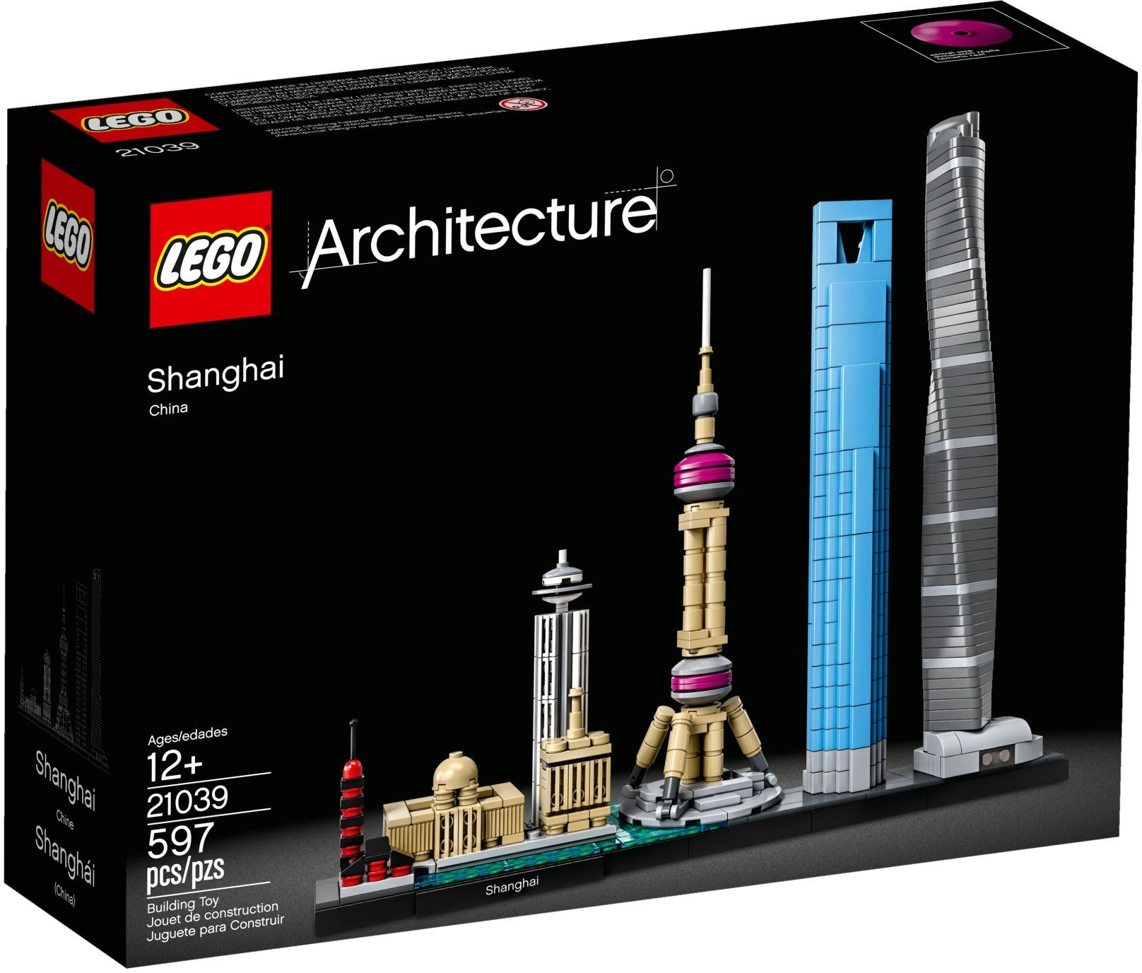
#21039 Shanghai Skyline. 597 pieces, $59.99 MSRP.
Tongue picanha pork belly doner, boudin pork chop ham hock ribeye sausage beef ribs meatball chicken. Cupim bacon pork loin, meatball short loin filet mignon doner.
Example: Medium
Medium images are best for supporting details in an article. On large displays, they fill two columns of the design grid, or 1/2 the width of the body text.
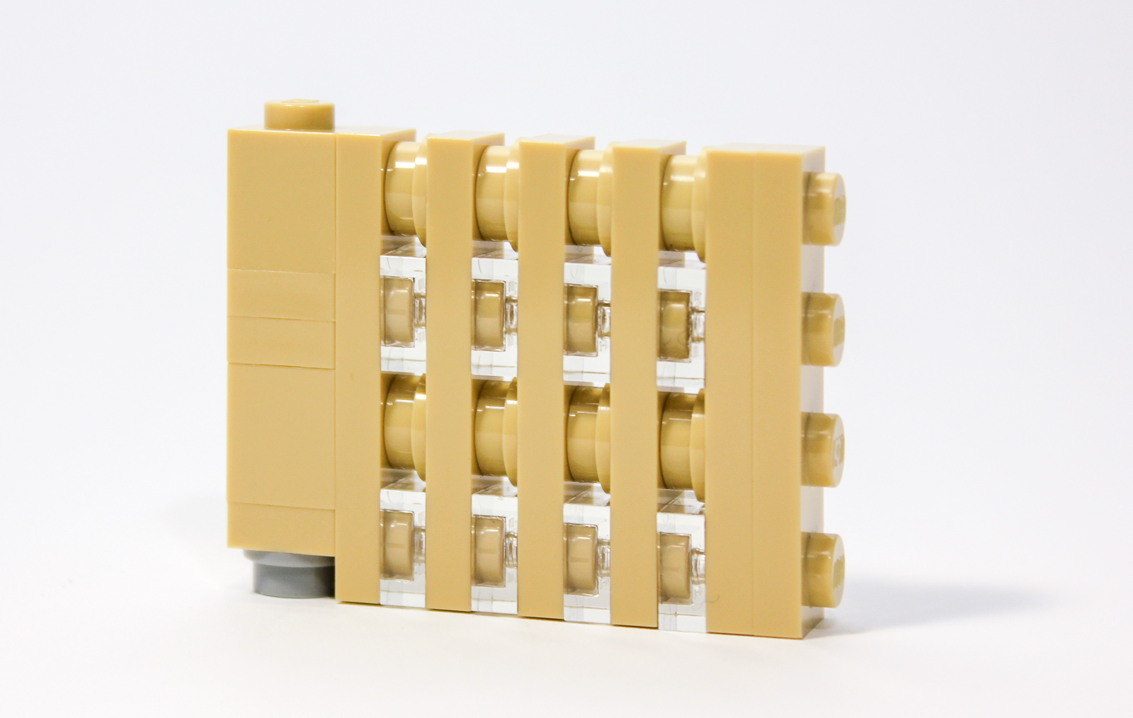
Detail showing how vertical windows are made using SNOT techniques.
Example: Thumbnail
Thumbnail images are very small and rarely used. They occupy just one column of the design grid (Just 1/4 the width of the body text on largest displays, not counting column padding.)

A tiny image with an exceptionally long caption that I wrote as a run-on sentence for the explicit purposes of testing the word-wrapping behavior of long sentences, especially on smaller displays which are common on phones in a portrait orientation.
HTML Code
Just use WordPress “Add Media” option. Ensure image is marked “size-pagewidth” for always full bleed images, “size-large” for images that are full-bleed on very small screens and inset on larger displays, and “size-medium” or “size-thumbnail” for always inset images.
“alignleft” is recommended in all cases.
Video
Work In Progress: This is a first draft of this approach. More validation needed!
Video is used very rarely, potentially in a stop motion context. When appropriate, video should start playing automatically. Content of 16×9 or wider should be full width when possible.
#45678 Spike Prime – Unboxing Stop Motion Video.
Lists
There are two kinds of lists used on the web: bulleted lists, and numbered lists. If the order of the items in a list is relevant, use a numbered list. If the items in the list are peers, use a bulleted list.
The font size will match the size of your body text. The text will be indented on large screens to match the column text, and left aligned on smaller screens.
Example: Ordered List
Spicy jalapeno bacon ipsum dolor amet tongue biltong boudin cupim kevin flank ribeye pork chop, pig bresaola sirloin meatball prosciutto ham hock cow. Tongue picanha pork belly doner, boudin pork chop ham hock ribeye sausage beef ribs meatball chicken.
If a list has a title, it uses this treatment.
- Some ordered text
- Some more text
- Just a little more text, I promise!
Spicy jalapeno bacon ipsum dolor amet tongue biltong boudin cupim kevin flank ribeye pork chop, pig bresaola sirloin meatball prosciutto ham hock cow. Tongue picanha pork belly doner, boudin pork chop ham hock ribeye sausage beef ribs meatball chicken.
HTML Code
<p class="list-heading">[Ordered List Title:]</p>
<ol>
	<li>[Ordered list text...]</li>
</ol>
Example: Bulleted List
Spicy jalapeno bacon ipsum dolor amet tongue biltong boudin cupim kevin flank ribeye pork chop, pig bresaola sirloin meatball prosciutto ham hock cow. Tongue picanha pork belly doner, boudin pork chop ham hock ribeye sausage beef ribs meatball chicken.
If a list has a title, it uses this treatment.
- Some unordered text
- Some more text
- Just a little more text, I promise!
Spicy jalapeno bacon ipsum dolor amet tongue biltong boudin cupim kevin flank ribeye pork chop, pig bresaola sirloin meatball prosciutto ham hock cow. Tongue picanha pork belly doner, boudin pork chop ham hock ribeye sausage beef ribs meatball chicken.
HTML Code
<p class="list-heading">[Bulleted List Title:]</p>
<ul>
	<li>[Un-ordered list text...]</li>
</ul>
Aside
Aside is used to display supplemental information. On large screens (1200px or wider), the aside appears as a sidebar—on the right hand side of the screen. On smaller screens, the aside content appears inline. You can control this inline behavior using a set of additional CSS classes you apply to the outer div.
Control inline behavior by adding these classes:
- optional – Aside content is hidden on small displays.
Not specified: Aside content displayed inline. - above – Aside content displayed above the associated “related-content”.
Not specified: Aside content displayed below “related-content”. - largeimage – “aside-image” remains 300px wide on small screens.
Not specified: “aside-image” reduced to 140px on small screens. - samestyle – Same style applied as the body text of article, no background color when on smaller screens.
Not specified: Aside content displayed with full bleed light gray background.
Example: Text
This example has no additional classes, so it gets the default behavior: On small screens, aside appears below content, with light gray background.
A short paragraph of sample text above an image.
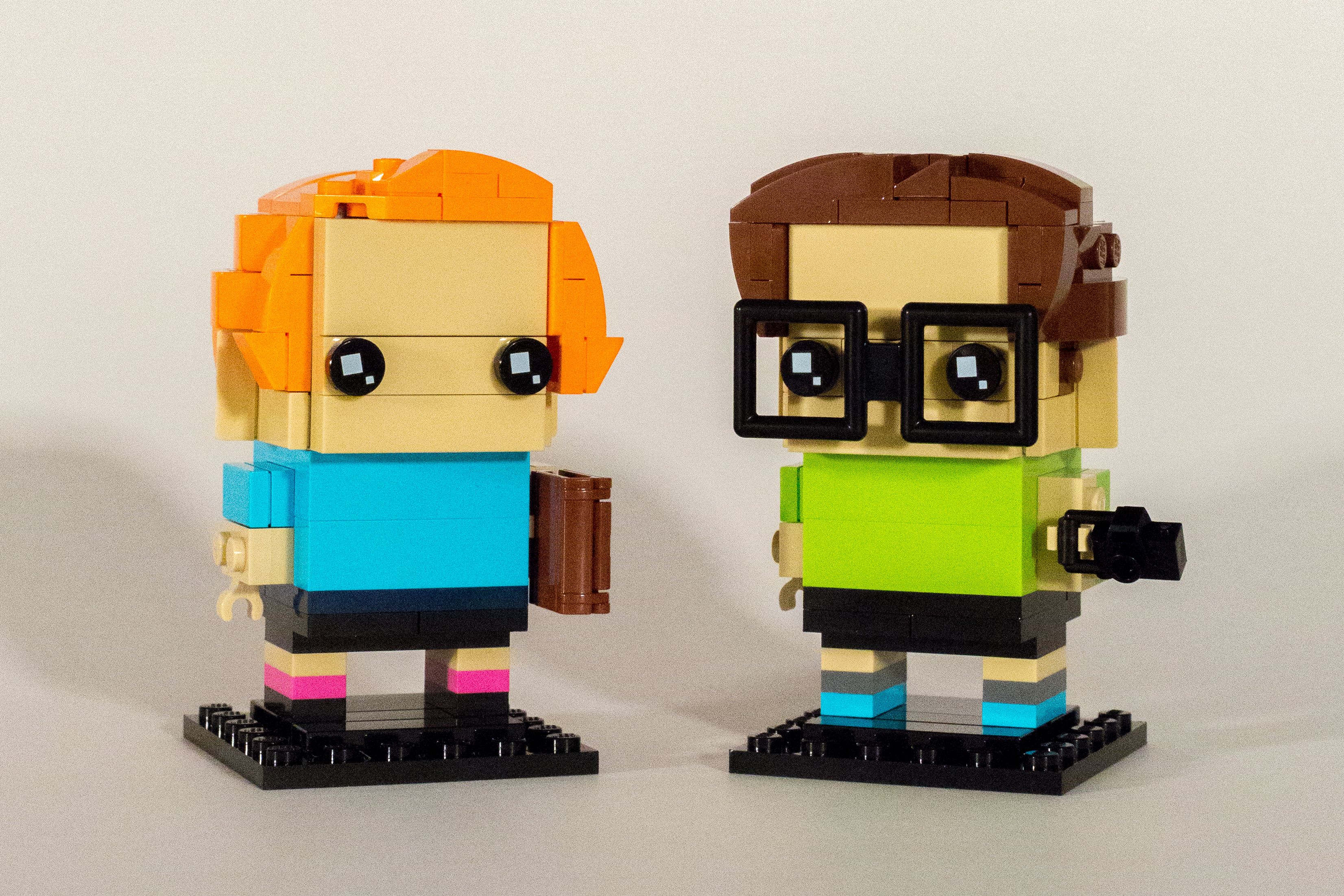
Our first two Customized Brickheadz figures based on the instructions in the booklet.
A short paragraph of sample text below an image.
A short paragraph below the “related” content block.
HTML Code
<div class="related">
	<section class="related-content">
		<p>[Body Text goes here]</p>
	</section>
	<aside class="related-aside">
		<p><em>[Aside text goes here]</em></p>
	</aside>
</div>
Example: Text (optional)
This example includes the “optional” class. It will be completely hidden on small screens. You can use this for completely supplemental information such as a pull quote which is also included in the body of the article.
A short paragraph of sample text above an image.
Our first two Customized Brickheadz figures based on the instructions in the booklet.
A short paragraph of sample text below an image.
A short paragraph below the “related” content block.
HTML Code
<div class="related optional">
	<section class="related-content">
		<p>[Body Text goes here]</p>
	</section>
	<aside class="related-aside">
		<p><blockquote>[Blockquote aside text goes here]</blockquote></p>
	</aside>
</div>
Example: Image and Text
This example shows the default behavior when image and text is displayed in the sidebar. The image is 300px wide on large screens, and 140px on small screens.
A short paragraph of sample text above an image.
Our first two Customized Brickheadz figures based on the instructions in the booklet.
A short paragraph of sample text below an image.
A short paragraph below the “related” content block.
HTML Code
<div class="related">
	<section class="related-content">
		<p>[Body Text goes here]</p>
	</section>
	<aside class="related-aside">
		<div class="aside-image"><img src="[image URL]" alt="[alt text]" width="300" height="300" class="size-medium" align="left" /></div>
		<div class="aside-text">
			<p>[aside text]</p>
		</div>
	</aside>
</div>
Example: Image and Text (above, largeimage, samestyle)
In this example, three classes modify the default inline behavior.
A short paragraph of sample text above an image.
Our first two Customized Brickheadz figures based on the instructions in the booklet.
A short paragraph of sample text below an image.
A short paragraph below the “related” content block.
HTML Code
<div class="related above largeimage samestyle">
	<section class="related-content">
		<p>[Body Text goes here]</p>
	</section>
	<aside class="related-aside">
		<div class="aside-image"><img src="[image URL]" alt="[alt text]" width="300" height="300" class="size-medium" align="left" /></div>
		<div class="aside-text">
			<p>[aside text]</p>
		</div>
	</aside>
</div>
Inline Callout
An inline callout is used in similar situations to “Aside”, but when you want to prevent the tangentially related content from appearing in the right column on large screens. It is displayed with a light gray background.
It was created to separate advertisements & mailinglist subscribe forms from the rest of the article contents… It simultaneously draws extra attention to the content, while trying to indicate that it isn’t exactly related either.
It can also be used for text that only relates loosely to the article, such as a longer aside…
Some Text…
Spicy jalapeno bacon ipsum dolor amet tongue biltong boudin cupim kevin flank ribeye pork chop, pig bresaola sirloin meatball prosciutto ham hock cow. Tongue picanha pork belly doner, boudin pork chop ham hock ribeye sausage beef ribs meatball chicken.
HTML Code
<div class="callout">
	<p>[sample content]</p>
</div>
Gallery (cardbox/card)
This is a gallery format typically used for products that we want to feature in a sincere / celebratory manner. Examples include holiday gift guides, and LEGO Storage Guide.
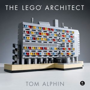
Learn 7 styles of architecture using LEGO. The book includes a brief history of each style, photos of amazing buildings to use for inspiration, and instructions to get started. Written by Brick Architect founder Tom Alphin.
4.7 Stars at Amazon, and available in 10 languages.

This new book is packed with great architectural details for LEGO builders to incorporate into their creations. Best for experienced LEGO builders with a large collection of bricks.
Brick Architect rated it “Highly Recommended” (4/5 stars). Read the Review.

Architecture Geeks: Join author Martin Filler in these collections of long essays exploring the life and legacy of prominent architects. These are not picture books, and are aimed at adult readers who are already familiar with a wide range of architectural styles and prominent architects.
These were invaluable resources while writing The LEGO Architect.

Get Organized! My LEGO Storage Guide offers in-depth suggestions to organize, sort, and store a LEGO collection of any size. Be sure to take a look, as there are some great storage rpducts for the LEGO Lover on your shopping list.
See how a well organized LEGO collection can unlock creativity!
HTML Code
<div class="cardbox">
	<div class="card">
		<div class="cardimage">[LINK - Image, size-medium (300x300px)]</div>
		<div class="cardtitle">[LINK - Title]</div>
		<div class="cardtext">
			<p>[primary text]</p>
			<p><em>[supporting text (optional link within text to related article/review)]</em></p>
		</div>
		<div class="cardlink">[LINK - $Price (round up), Store.]</div>
	</div>
</div>
Examples
- Brick Architect’s 2019 Holiday Gift Guide.
- Brick Architect Holiday Gift Guide.
- LEGO Storage for Large Collections.
Blockquotes
Used to make a quotation from article or interview stand out, almost in place of an image to break up a long section of text. Can be used inline with body of text, or in an “aside”. When used as an aside, text is smaller if width >1200, and additional consideration required about whether it is “optional” – making it hidden on narrower screens.
Example: Inline, No Citation
A quote doesn’t need a citation.
HTML Code
<blockquote>
    <p>Quoted text goes here</p>
</blockquote>
Example: Inline with Citation
This is … in my imagination, one of the oldest buildings on modular street.
Anderson Ward Grubb
HTML Code
<blockquote>
    <p>Quoted text goes here</p>
    <cite>person being quoted</cite>
</blockquote>
Example: Inline with Citation, Smaller
This is … in my imagination, one of the oldest buildings on modular street.
Anderson Ward Grubb
HTML Code
<blockquote class="smaller">
    <p>Quoted text goes here</p>
    <cite>person being quoted</cite>
</blockquote>
Blockquote in an Aside
A blockquote can be placed in an “aside” with any supported parameters of the aside (such as above, samestyle, or optional). Here are a few examples – the syntax is straightforward, just place the blockquote within the aside.
Example: with “optional” attribute and a citation
Example: with “samestyle” and “above” attributes and no citation
Burgdoggen tail shank, frankfurter sausage alcatra kielbasa sirloin fatback strip steak prosciutto ham.
Example: with no attributes and a citation
Burgdoggen tail shank, frankfurter sausage alcatra kielbasa sirloin fatback strip steak prosciutto ham.
Example: with “smaller” attributes and a citation
Burgdoggen tail shank, frankfurter sausage alcatra kielbasa sirloin fatback strip steak prosciutto ham.
Examples
- Interview: Secret history of #10297 Boutique Hotel with Anderson Ward Grubb & Ashwin Visser
Inline blockquotes with citation - Interview: Matteo Mobili’s Movie-inspired LEGO Skylines
Captions in the aside area w/out a citation. Marked ‘optional’ so they dissapear on smaller screens. - Interview: Ekow Nimako’s Afrofuturistic Architecture
An interview that’s a bit sparse on images, so I added two inline blockquotes to reinforce key messages.
Interviews
Brick Architect: First Question?
interviewee: Answer part one…
Answer part two…
HTML Code
<div class="interview-q">
    <p><span class="questioner">Brick Architect:</span> First Question?</p>
</div>
<div class="interview-a">
	<p><span class="answerer">interviewee:</span> Answer part one...</p>
	<p>Answer part two...</p>
</div>
Examples
Bullet Icons
Use the following class names for custom bullet icons:
- icon person
- icon people
- icon link
- icon podcast
- icon news
- icon forum
- icon questioncircle
- icon exclamationtriangle
- icon lightbulb
- icon event
- icon youtube
- icon instagram
- icon pinterest
- icon reddit
- icon zip
- icon pdf
HTML Code
<ul>
	<li class="icon name">Text goes here</li>
</ul>
Examples
- Social Media & Person/People icons: Meet the LEGO Masters… on Youtube, Instagram, and more.
- zip/pdf icons: LEGO Brick Labels.
- Link icons: (This page).
Numbers, Units, Measurements
Due to the technical nature of this website, it often makes sense to include measurements. (This is especially relevant for the LEGO Storage Guide.)
Since more than 50% of our readers are in the USA, write imperial measurements first, followed by metric (in parenthesis.) Use small fractions when possible, and use the correct Multiplication sign.
Include both Imperial and Metric measurements.
- …each label is less than 2″ (5 cm) wide.
- use the correct primes for inches and feet:
- Inches = ″ =
″ - Feet = ′ =
′
- Inches = ″ =
Mathematical symbols:
- Degree = ° =
° - Multiply = × =
×
Use Small Fractions:
- 1/2 = ½ =
½ - 1/3 = ⅓ =
⅓ - 2/3 = ⅔ =
⅔ - 1/4 = ¼ =
¼ - 3/4 = ¾ =
¾ - 1/5 = ⅕ =
⅕ - 2/5 = ⅖ =
⅖ - 3/5 = ⅗ =
⅗ - 4/5 = ⅘ =
⅘ - 1/6 = ⅙ =
⅙ - 5/6 = ⅚ =
⅚ - 1/8 = ⅛ =
⅛ - 3/8 = ⅜ =
⅜ - 5/8 = ⅝ =
⅝ - 7/8 = ⅞ =
⅞ - 1/10 = ⅒ =
⅒
Examples
Page Title
Page Title h1 class=”post-title”
Heading h1
Spicy jalapeno bacon ipsum dolor amet tongue biltong boudin cupim kevin flank ribeye pork chop, pig bresaola sirloin meatball prosciutto ham hock cow. Tongue picanha pork belly doner, boudin pork chop ham hock ribeye sausage beef ribs meatball chicken. Cupim bacon pork loin, meatball short loin filet mignon doner. Shank frankfurter beef ribs meatloaf pork loin picanha shankle jerky tri-tip turducken prosciutto.
Images:

Large photo with caption, no link.
Rump shank pancetta, beef pork belly meatloaf tri-tip hamburger chuck kielbasa pork tenderloin salami.

“Full” size image goes edge to edge.
Chicken bresaola jerky pork belly pork chop corned beef. Sirloin leberkas tongue kevin, cow frankfurter fatback ball tip meatball tenderloin shoulder chicken doner. Sausage burgdoggen ham, pork belly swine pork loin shank pastrami turkey short loin chicken ball tip.

Medium photo with caption, no link.
Chicken bresaola jerky pork belly pork chop corned beef. Sirloin leberkas tongue kevin, cow frankfurter fatback ball tip meatball tenderloin shoulder chicken doner. Sausage burgdoggen ham, pork belly swine pork loin shank pastrami turkey short loin chicken ball tip.

Thumbnail photo with caption, no link.
Sirloin leberkas tongue kevin, cow frankfurter fatback ball tip meatball tenderloin shoulder chicken doner.
Large photo with caption and hyperlink.
Sausage burgdoggen ham, pork belly swine pork loin shank pastrami turkey short loin chicken ball tip.
NOTE: Use alignment: ‘none’, or ‘center’ when adding images without a caption using WordPress “Add Media” feature. (‘none’ preferred as of 2016/11/21.)
Shank meatloaf fatback, filet mignon rump leberkas pig. Burgdoggen tail shank, frankfurter sausage alcatra kielbasa sirloin fatback strip steak prosciutto ham. Turkey chuck fatback, rump cow capicola frankfurter sirloin jerky short ribs tongue. Pork loin t-bone boudin chicken, brisket meatball beef ribs.
Content With Breakout:
<div class="cwb">

<div class="cwb-content">[content]</div>

<div class="cwb-breakout">[breakout]</div>

</div>
NOTE: If you put TEXT in the Content section, it should be wrapped in a <p>. If you put an image in the content section, it should have a max 600px width.

The grand prize winner will receive one copy of #21039 Shanghai Skyline
A minifigure wearing a dress is 3mm taller than one with standard minifigure legs. (The dress is just a 2x2x2 Slope — Part #3678.)
Sausage burgdoggen ham, pork belly swine pork loin shank pastrami turkey short loin chicken ball tip.
Post Title (h1 class=post-title)
<h1 class="post-title">Title of Article or Page</h1>
Title of Article or Page
Sausage burgdoggen ham, pork belly swine pork loin shank pastrami turkey short loin chicken ball tip.
Heading 1:
<h1>Heading Level 1 (h1)</h1>
Heading Level 1
Sausage burgdoggen ham, pork belly swine pork loin shank pastrami turkey short loin chicken ball tip.
Heading 2:
<h2>Heading Level 2 (h2)</h2>
Heading Level 2
Sausage burgdoggen ham, pork belly swine pork loin shank pastrami turkey short loin chicken ball tip.
Heading 3:
<h3>Heading Level 3 (h3)</h3>
Heading Level 3
Sausage burgdoggen ham, pork belly swine pork loin shank pastrami turkey short loin chicken ball tip.
Heading 4:
<h4>Heading Level 4 (h4)</h4>
NOTE: H4 not recommended, as it’s hard to keep track of that many levels of hierarchy. (H5/H6 not supported by my theme.)
Heading Level 4
Sausage burgdoggen ham, pork belly swine pork loin shank pastrami turkey short loin chicken ball tip.
Highlighted Text:
<span class="highlight">Highlighted Text.</span>
Highlighted text.
Conclusion:
<div class="conclusion">Conclusion to page or article.</div>
Captions
[description]
[description] (Photo [photographer], [license])
[building], [year], in [city], [country/state], by architect [architect name]. (Photo [photographer], [license])
Appendix – History
This history describes both improvements to this styleguide page, the Themes/Stylesheets that make this website look great, and content changes needed to take advantage of these visual improvements.
- January 13, 2022 – First draft of syntax for using videos in articles – new section!
- January 12, 2022 – Added a section to this guide explaining how to use blockquotes, with custom styling for inline and sidebars, and very bold treatment that’s meant to take the place of a photo in breaking up the narrative flow and reinforcing key themes. (I also made blockquote much more attractive, inspired by pull quotes in The 2022 PRINT Typography Report – printmag.com ).
- April 15, 2020 – Implemented basic category and author index pages (even though there aren’t any links to those URL’s on the site).
- April 12, 2020 – Improvements focused on the Homepage & Category/Author Archives, and pages for ‘The LEGO Architect’ book:
- Borderless ‘Featured image’ for the Homepage & Category/Author Archives. (Before this change, ‘Featured image’ was inset 30px.)
- Each category was given a description that is shown on the Category Archive. (category URLs were normalized, and seldom-used categories were removed.)
- Page title font consistent across Posts, Pages, Homepage, Author Archive, and Category Archive.
- Pages for ‘The LEGO Architect’ book, subpages containing additional resources, and nine foreign-language editions updated to use latest formatting standards (such as ‘aside’ and unicode characters).
- March 11, 2020 – I’ve made a ton of changes in the past few weeks/months, but here are the key highlights:
- Clarified correct image sizes to use. (especially “size-pagewidth” instead of “full”).
- Added “larger” and “smaller” styles for text, for those cases where emphasis or supplemental info is needed (created for the LEGO Brick Labels page).
- Option to show popular Icons (YouTube, Instagram, PDF, etc…) instead of a dot in bulleted lists. Used extensively for LEGO Masters article.
- Section with syntax for extended characters (such as: ″, ⅛, °)
- Corresponding CSS changes were needed to support these changes, plus CSS bugfixes such as bullet indentation on small screens, and CSS code cleanup.
- August 24, 2019 – Switched from “code” to “pre” for code snippets so tab indentations were preserved. Fixed bugs in samples, and explanation of various image sizes.
- November 8, 2018 – This is a work in progress. I am updating this document as I go to reflect updated style guidelines associated with November 2018 update to the theme to use a predictable design grid.